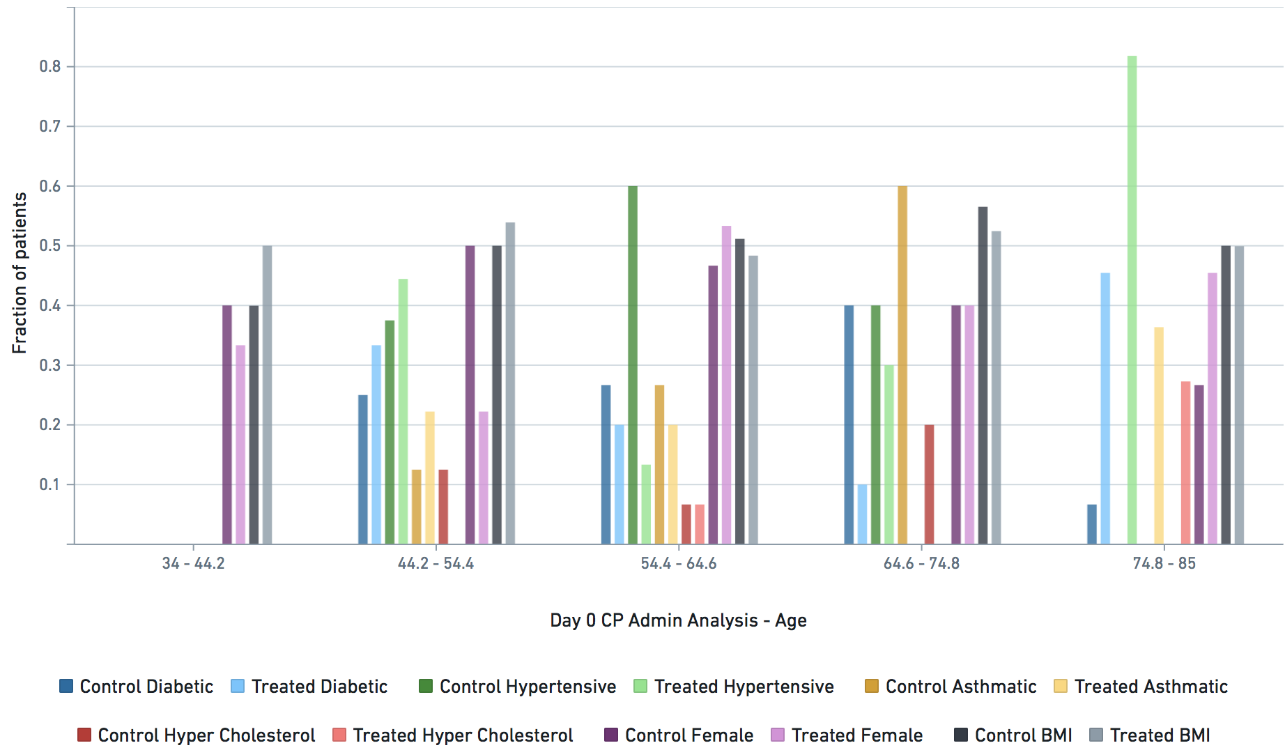
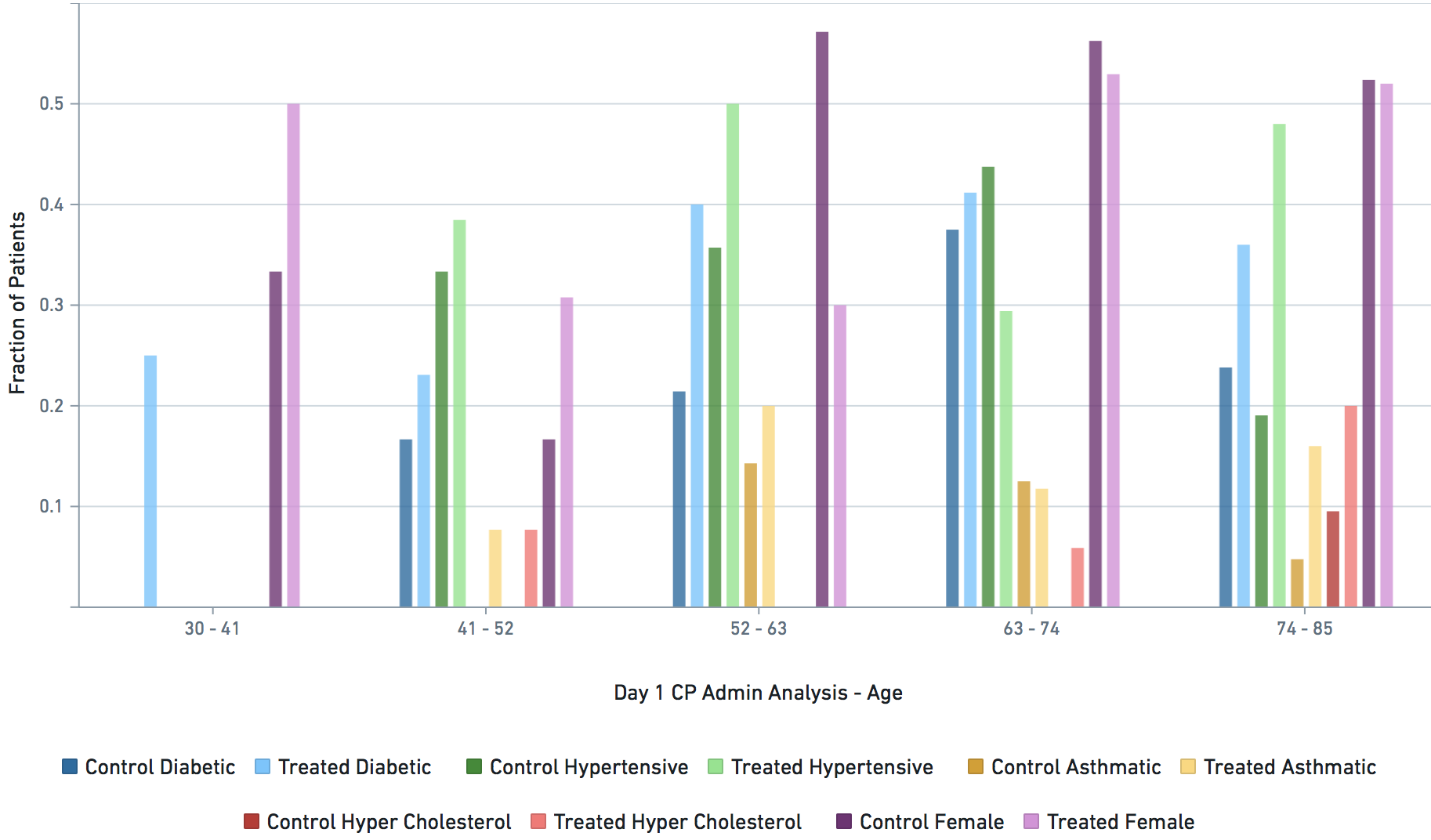
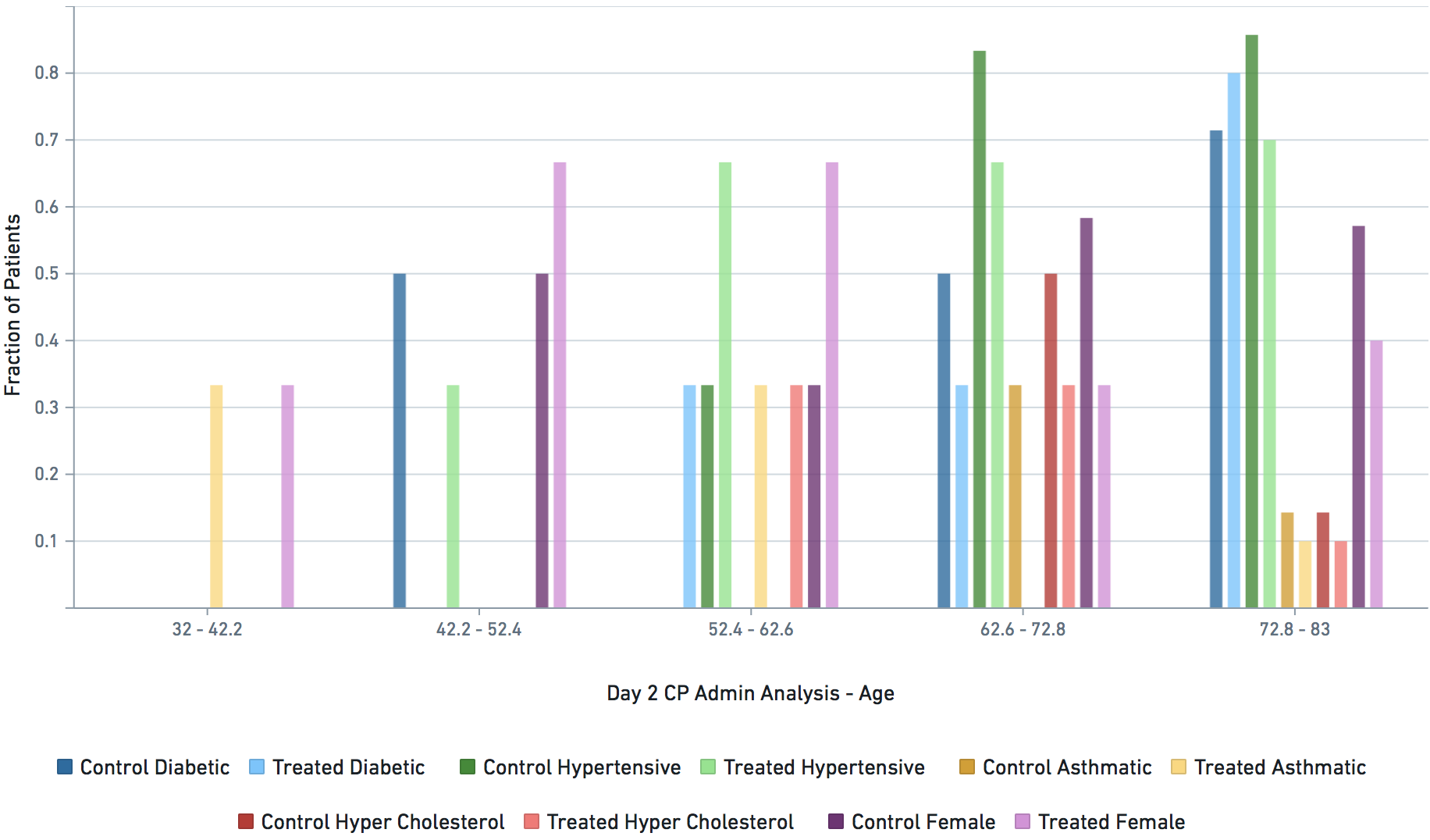
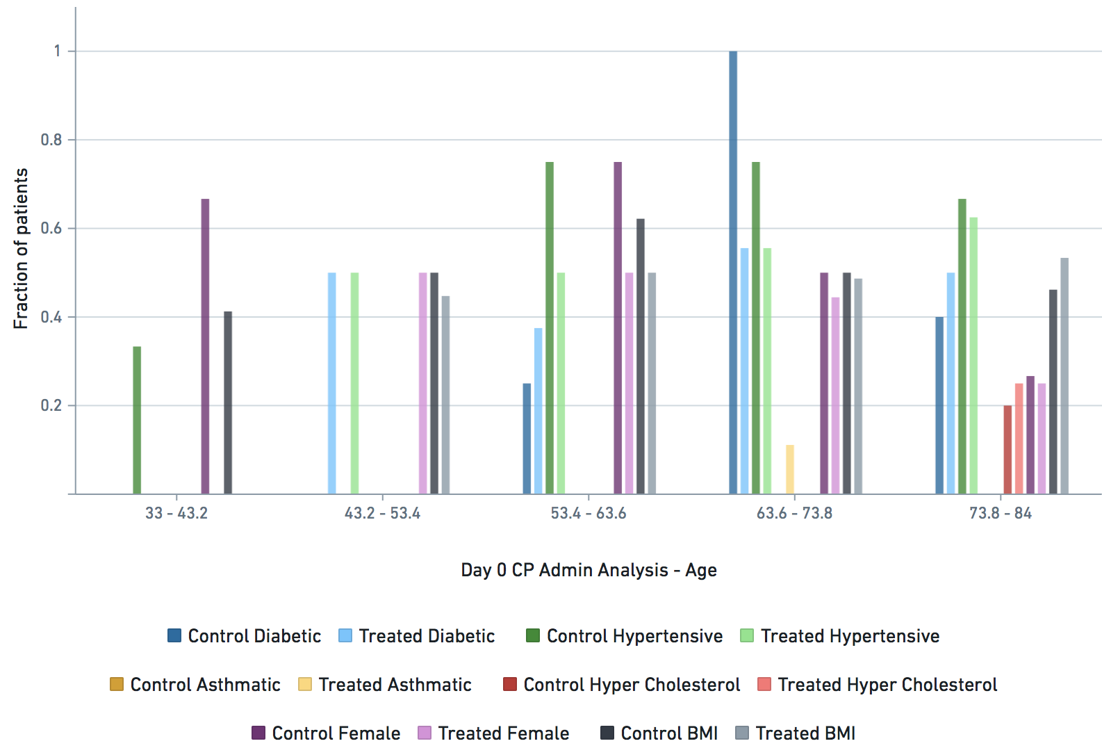
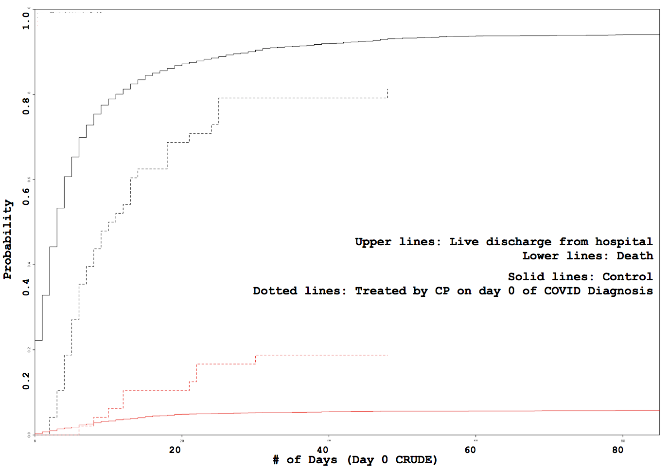
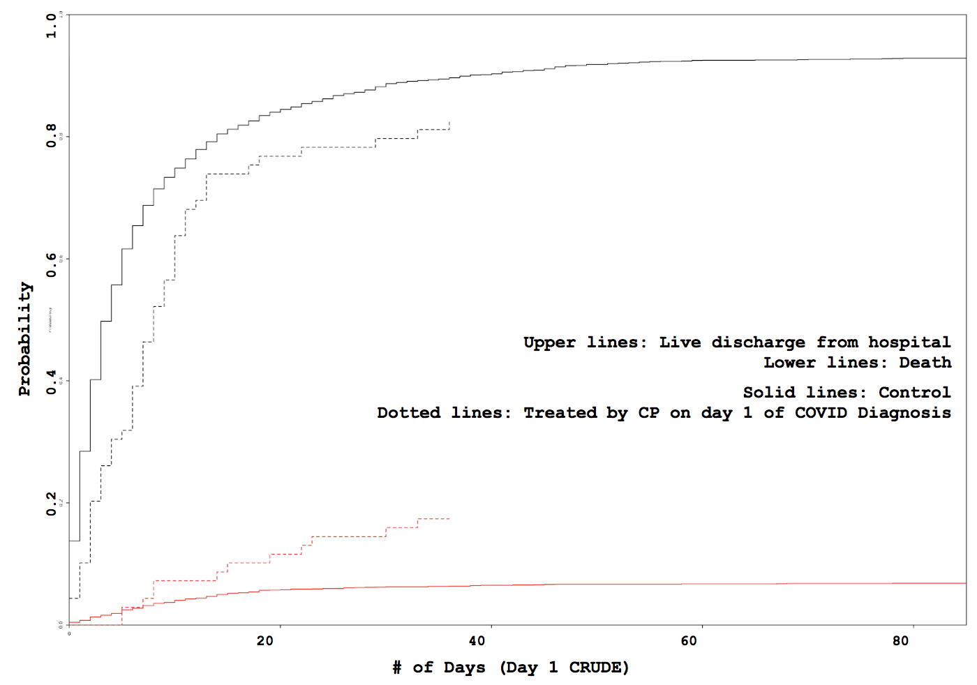
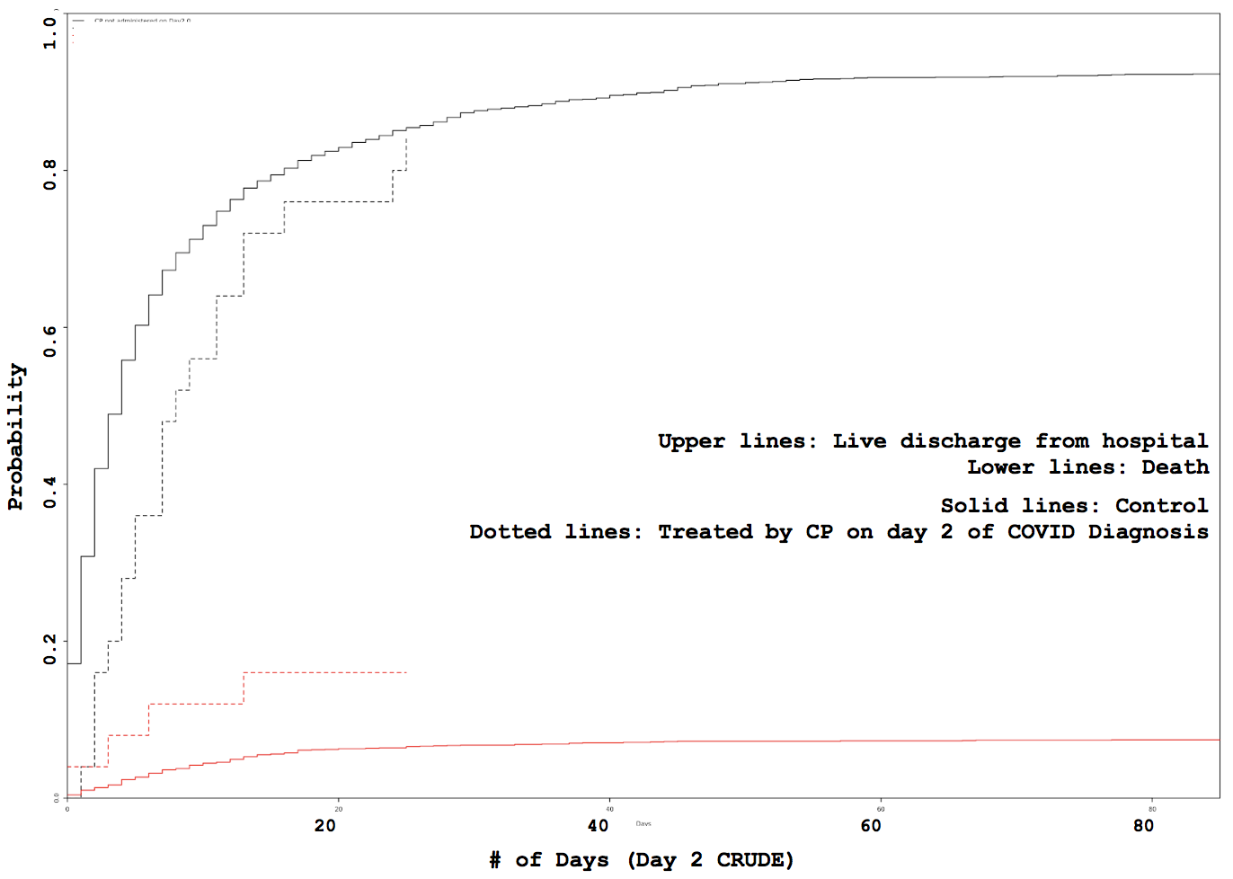
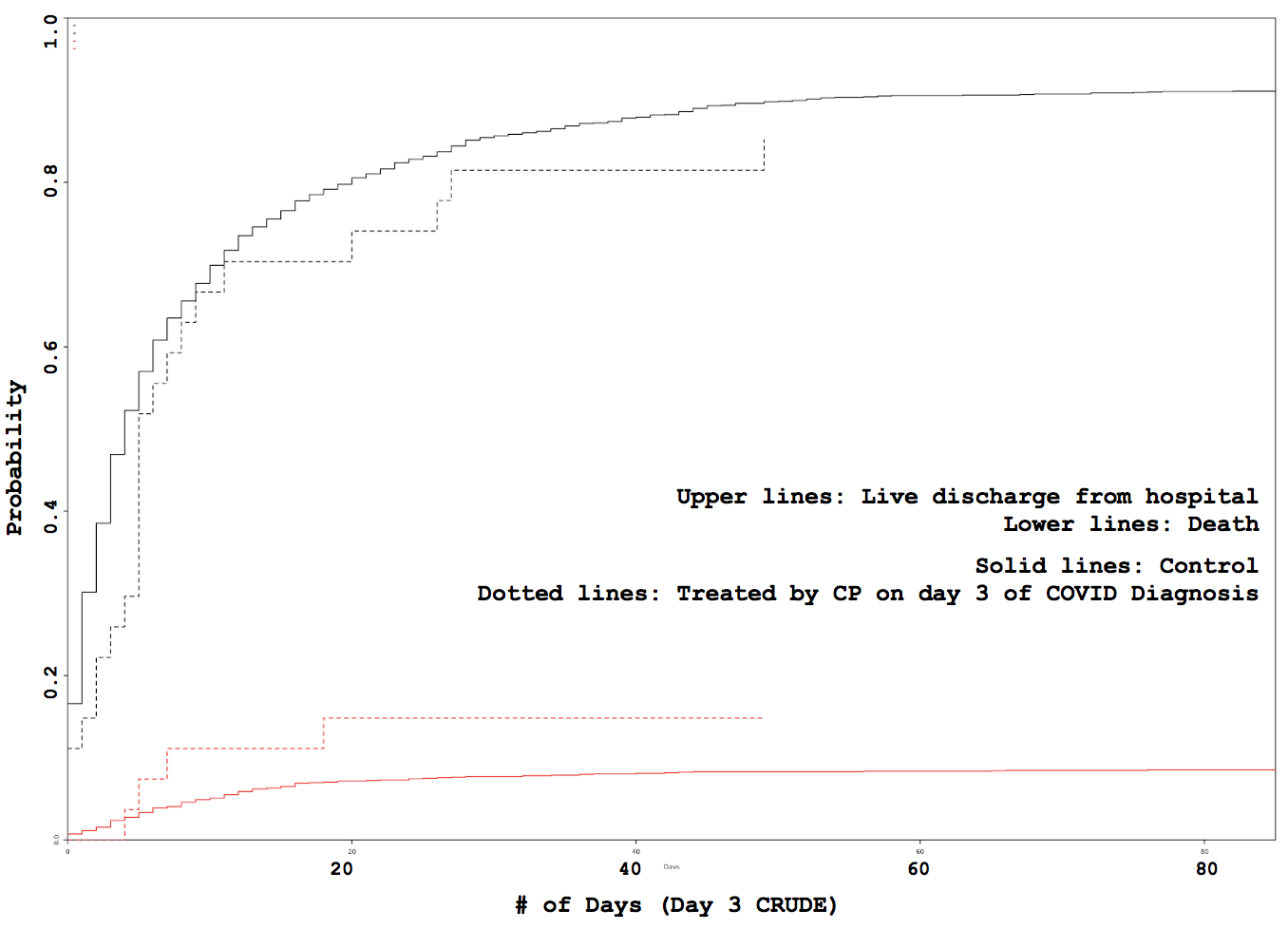
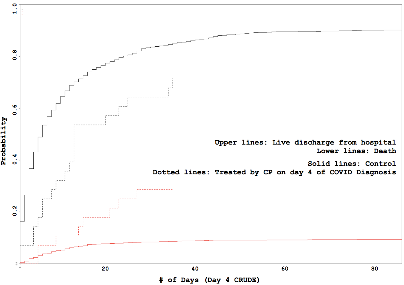
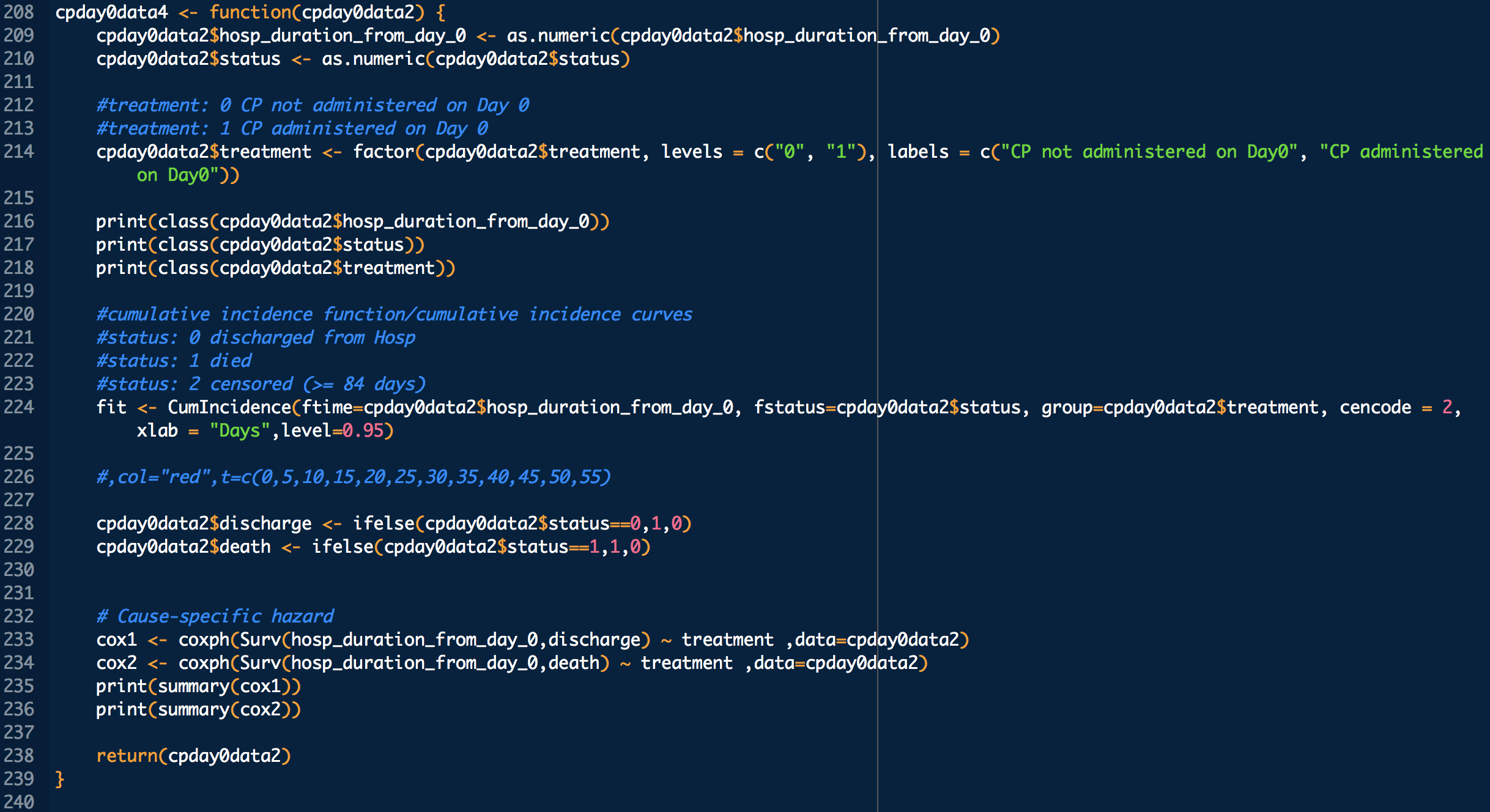
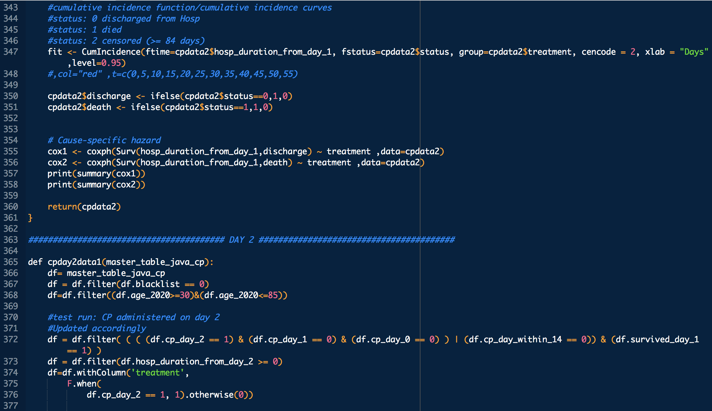
Administration day stratified analysis of convalescent plasma use shows no effect on COVID-19 hospitalization length

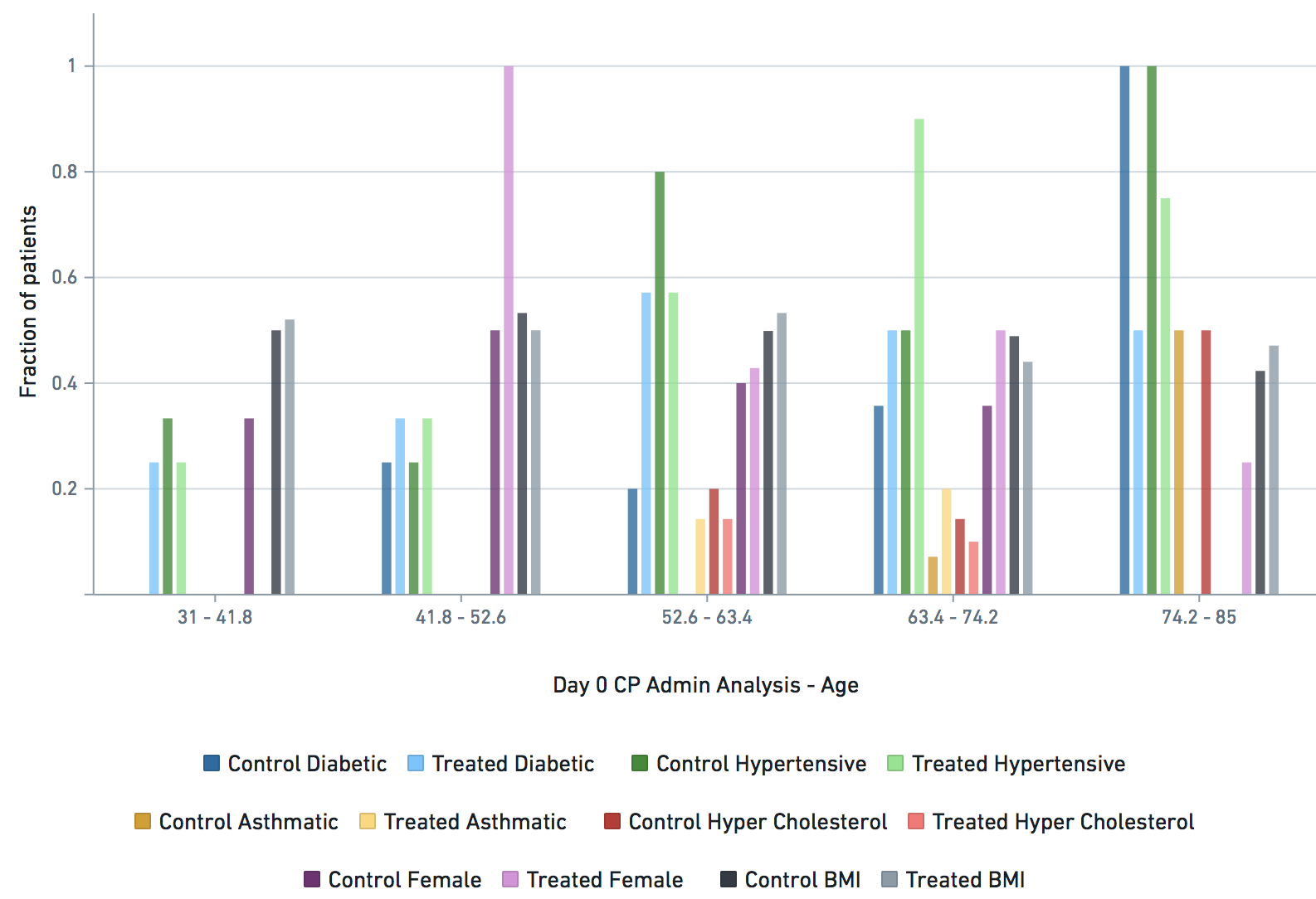
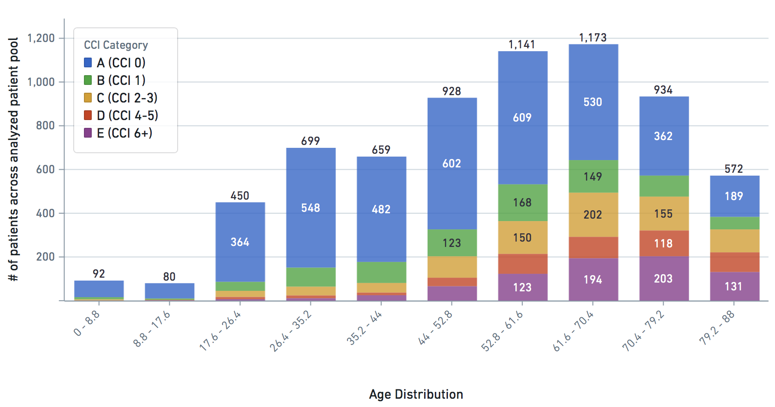
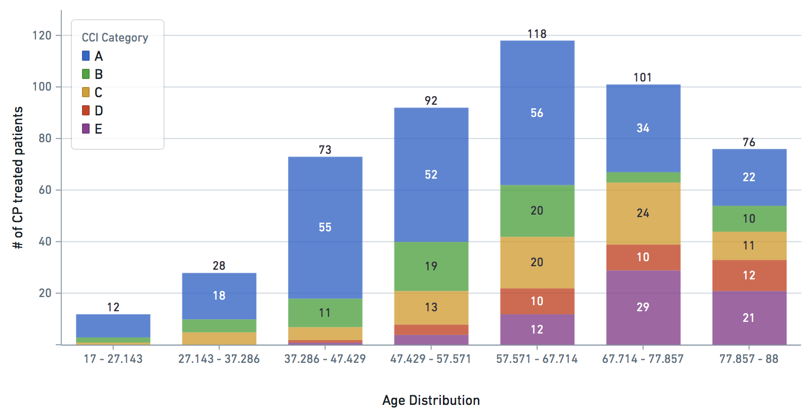
Applicable demographic/clinical distribution information based on 12-19-2020 N3C Data Release (Release v16). Supplementary materials of manuscript.

Supplementary Data Image
Figure S1a: Gender, BMI, Diabetic, Hypertension distribution across age groups (as fraction of age group) for treated (with CP on day 0) and matched control cohorts used for statistically significant clinical effect analysis. The darker shade of each colored pair is Control (untreated), while the lighter shade is Treated (with CP). For example, the dark purple (control cohort) and light purple (treated cohort) bars on each age group represent the fraction of patients in those age groups that are female.
Supplementary Data Image
Figure S1b: Gender, BMI, Diabetic, Hypertension distribution across age groups (as fraction of age group) for treated (with CP on day 1) and matched control cohorts used for statistically significant clinical effect analysis. The darker shade of each colored pair is Control (untreated), while the lighter shade is Treated (with CP). For example, the dark purple (control cohort) and light purple (treated cohort) bars on each age group represent the fraction of patients in those age groups that are female.
Supplementary Data Image
Figure S1c: Gender, BMI, Diabetic, Hypertension distribution across age groups (as fraction of age group) for treated (with CP on day 2) and matched control cohorts used for statistically significant clinical effect analysis. The darker shade of each colored pair is Control (untreated), while the lighter shade is Treated (with CP). For example, the dark purple (control cohort) and light purple (treated cohort) bars on each age group represent the fraction of patients in those age groups that are female.
Supplementary Data Image
Figure S1d: Gender, BMI, Diabetic, Hypertension distribution across age groups (as fraction of age group) for treated (with CP on day 3) and matched control cohorts used for statistically significant clinical effect analysis. The darker shade of each colored pair is Control (untreated), while the lighter shade is Treated (with CP). For example, the dark purple (control cohort) and light purple (treated cohort) bars on each age group represent the fraction of patients in those age groups that are female.
Supplementary Data Image
Figure S1e: Gender, BMI, Diabetic, Hypertension distribution across age groups (as fraction of age group) for treated (with CP on day 4) and matched control cohorts used for statistically significant clinical effect analysis. The darker shade of each colored pair is Control (untreated), while the lighter shade is Treated (with CP). For example, the dark purple (control cohort) and light purple (treated cohort) bars on each age group represent the fraction of patients in those age groups that are female.
Supplementary Data Image
Figure S2a: Patient state indicator distribution across age groups (as metric normalized between 0 and 1) for treated (with CP on day 0) and matched control cohorts used for statistically significant clinical effect analysis. The darker shade of each colored pair is Control (untreated), while the lighter shade is Treated (with CP). For example, the dark purple (control cohort) and light purple (treated cohort) bars on each age group represent max temperature (normalized between 0 and 1).
Supplementary Data Image
Figure S2b: Patient state indicator distribution across age groups (as metric normalized between 0 and 1) for treated (with CP on day 1) and matched control cohorts used for statistically significant clinical effect analysis. The darker shade of each colored pair is Control (untreated), while the lighter shade is Treated (with CP). For example, the dark purple (control cohort) and light purple (treated cohort) bars on each age group represent max temperature (normalized between 0 and 1).
Supplementary Data Image
Figure S2c: Patient state indicator distribution across age groups (as metric normalized between 0 and 1) for treated (with CP on day 2) and matched control cohorts used for statistically significant clinical effect analysis. The darker shade of each colored pair is Control (untreated), while the lighter shade is Treated (with CP). For example, the dark purple (control cohort) and light purple (treated cohort) bars on each age group represent max temperature (normalized between 0 and 1).
Supplementary Data Image
Figure S2d: Patient state indicator distribution across age groups (as metric normalized between 0 and 1) for treated (with CP on day 3) and matched control cohorts used for statistically significant clinical effect analysis. The darker shade of each colored pair is Control (untreated), while the lighter shade is Treated (with CP). For example, the dark purple (control cohort) and light purple (treated cohort) bars on each age group represent max temperature (normalized between 0 and 1).
Supplementary Data Image
Figure S2e: Patient state indicator distribution across age groups (as metric normalized between 0 and 1) for treated (with CP on day 4) and matched control cohorts used for statistically significant clinical effect analysis. The darker shade of each colored pair is Control (untreated), while the lighter shade is Treated (with CP). For example, the dark purple (control cohort) and light purple (treated cohort) bars on each age group represent max temperature (normalized between 0 and 1).
Supplementary Data Image
Figure S3a: CCI distribution by age group in dataset
Supplementary Data Image
Figure S3b: CCI distribution by age group in treated patients
Supplementary Data Image
Figure S4: CP administration distribution from day of COVID+ diagnosis
Supplementary Data Image
Figure S5a: Predictor incidence by age group of certain key pre-COVID predictors used for cohort statistical analysis (assessed dataset)
Supplementary Data Image
Figure S5b: Predictor incidence by age group of certain key pre-COVID predictors used for cohort statistical analysis (treated)
Supplementary Data Image
Figure S6a: CRUDE (unmatched) CIF visualization for Day 0 CP administered
Supplementary Data Image
Figure S6b: CRUDE (unmatched) CIF visualization for Day 1 CP administered
Supplementary Data Image
Figure S6c: CRUDE (unmatched) CIF visualization for Day 2 CP administered
Supplementary Data Image
Figure S6d: CRUDE (unmatched) CIF visualization for Day 3 CP administered
Supplementary Data Image
Figure S6e: CRUDE (unmatched) CIF visualization for Day 4 CP administered


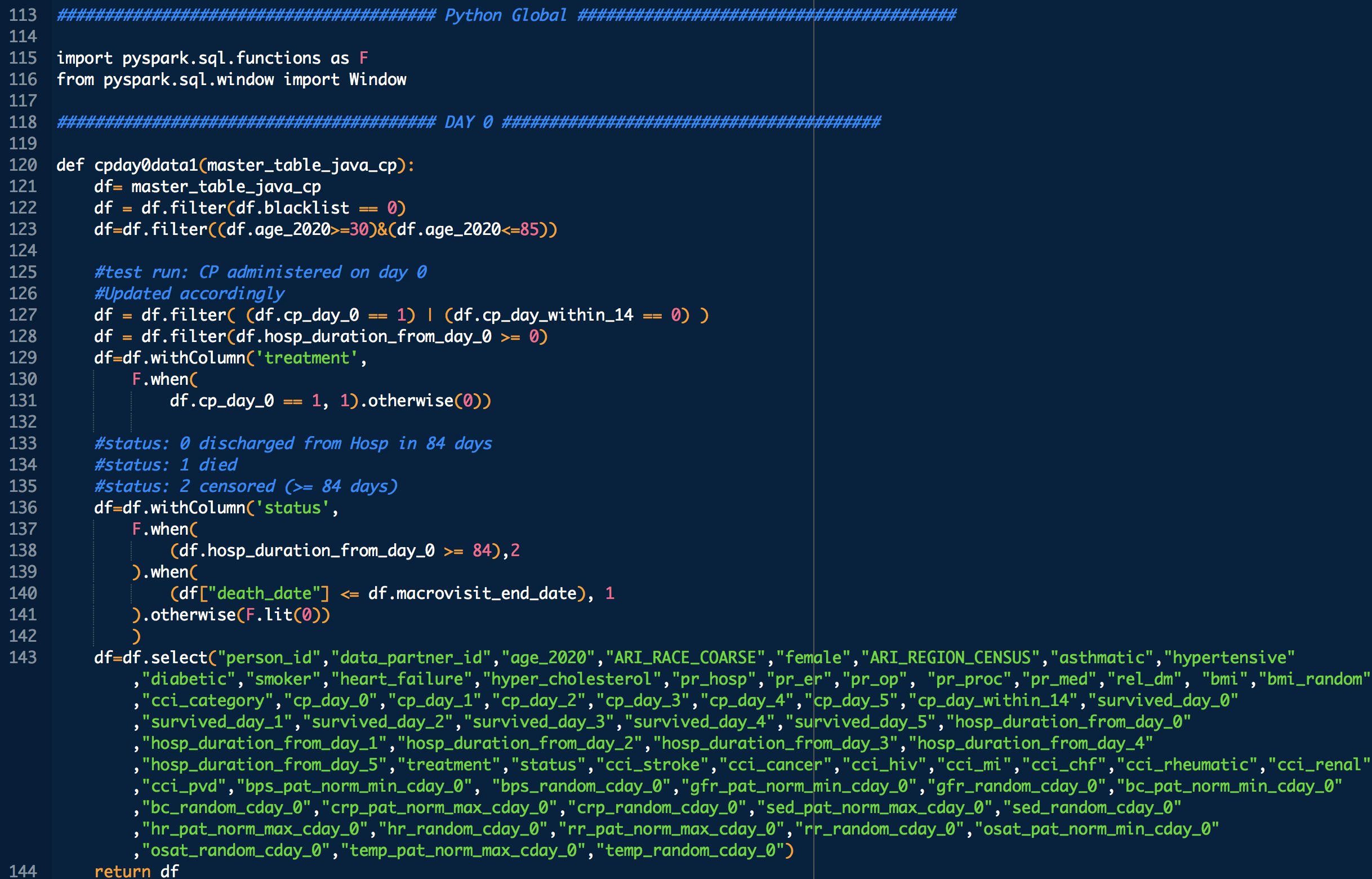
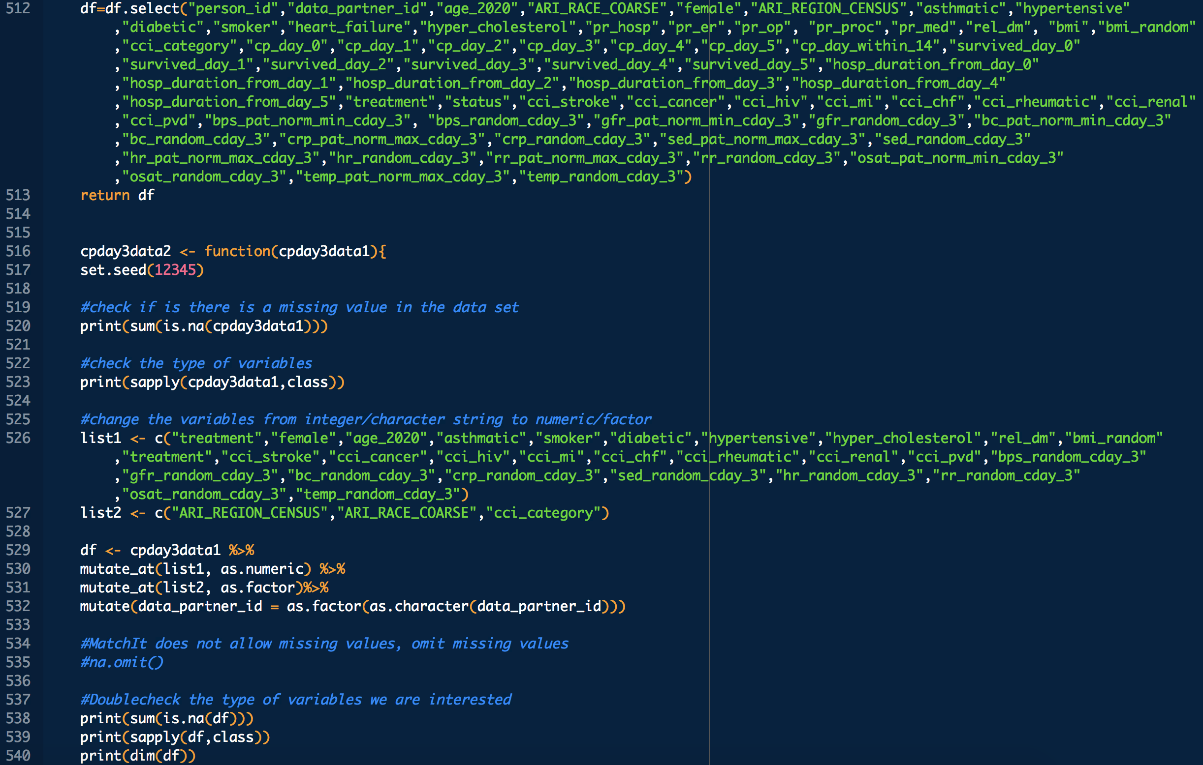
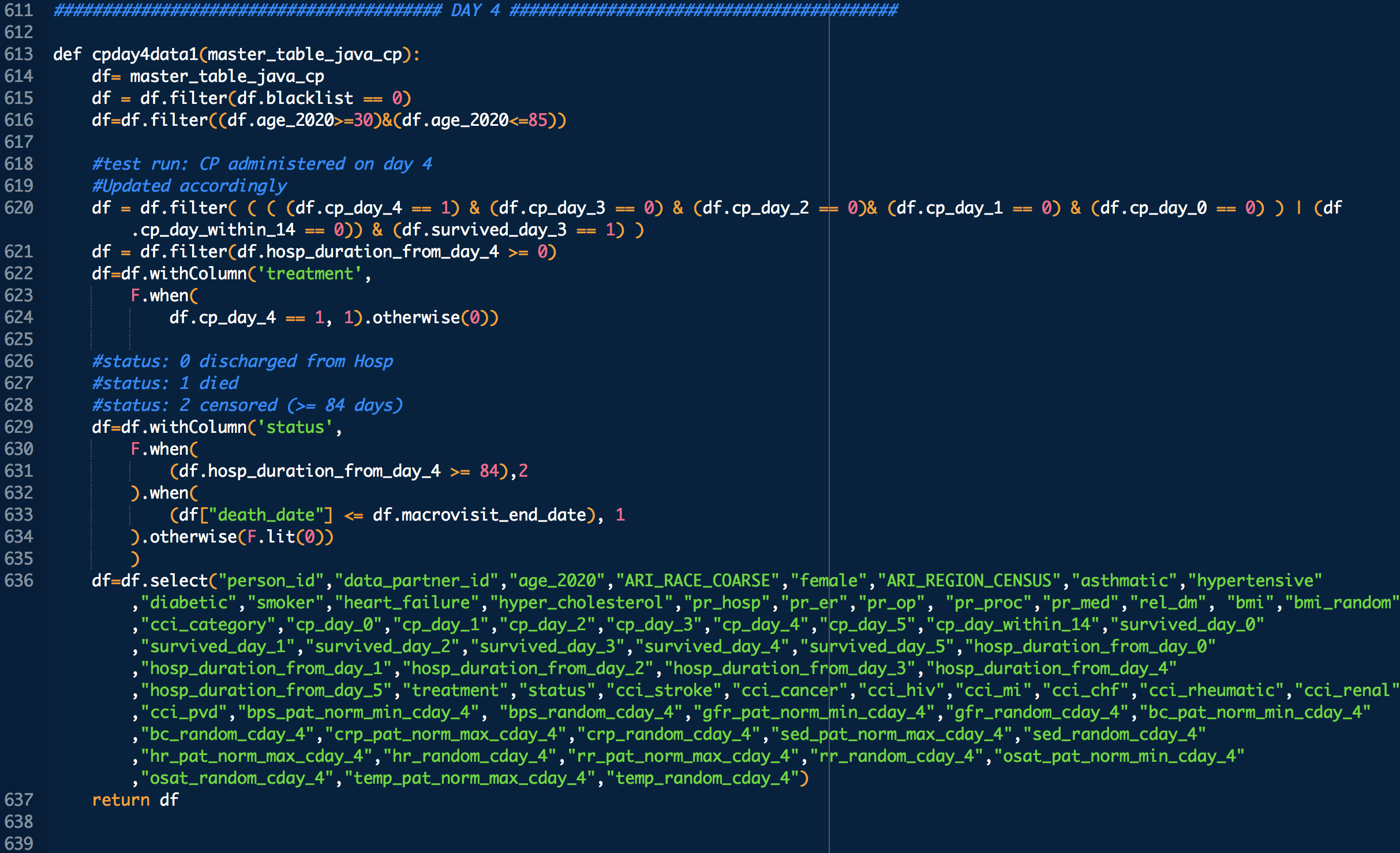
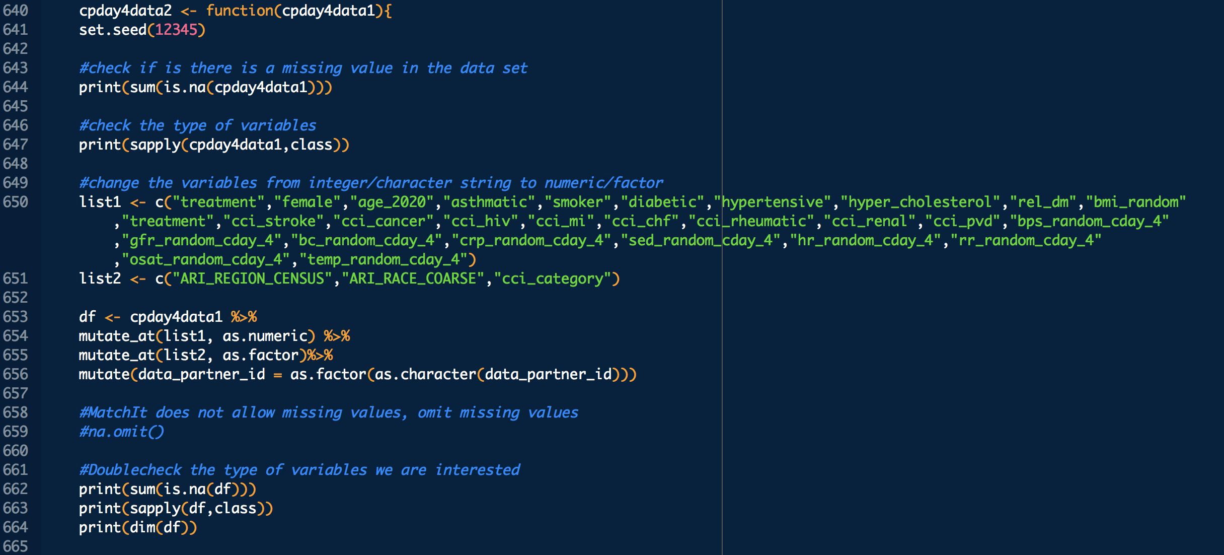
Some VARIABLE definitions:

PRE COVID-19:

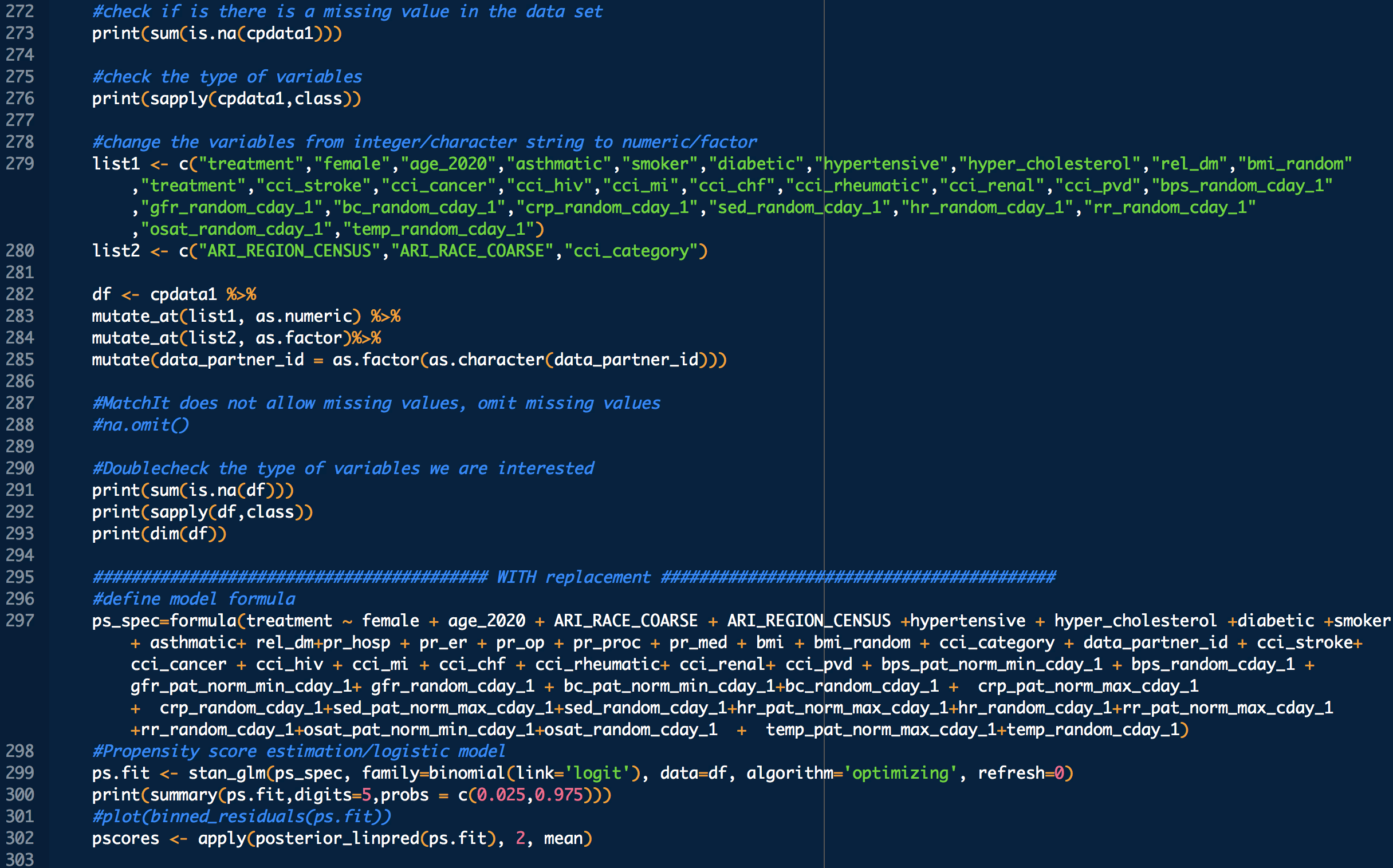
    female = 1 means female, otherwise male
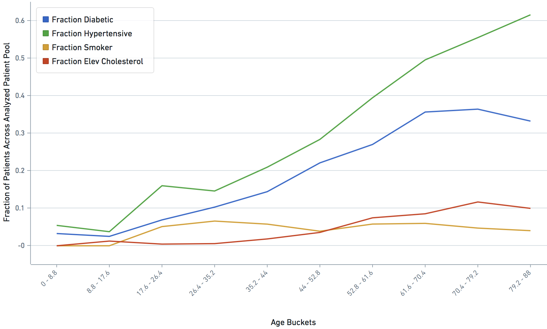
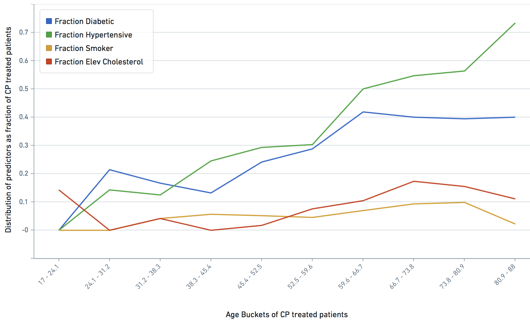
    age_2020 = age in the year 2020
    ARI_REGION_CENSUS = census regions
    ARI_RACE_COARSE = race
    asthmatic = 1 prior chronic respiratory disorder, 0 otherwise
    smoker = 1,0 self explanatory
    diabetic = 1 prior diabetes diagnosis, 0 otherwise
    hypertensive = 1 prior hypertension diagnosis, 0 otherwise
    cci_category = 0->A, 1->B , 2 and 3 -> C, 4 -> D, 5+ -> E
    rel_dm = covid related dexamethasone use
    hyper_cholesterol = 0 -> no evidence of elevated cholesterol, 1->evidence of elevated cholesterol
    cci_stroke = 1 if there was evidence of stroke, an underlying calculation factor for Charlson Comorbidity Index, 0 otherwise
    cci_cancer = 1 if there was evidence of stroke, an underlying calculation factor for Charlson Comorbidity Index, 0 otherwise
    cci_hiv = 1 if there was evidence of stroke, an underlying calculation factor for Charlson Comorbidity Index, 0 otherwise
    cci_mi  = 1 if there was evidence of stroke, an underlying calculation factor for Charlson Comorbidity Index, 0 otherwise
    cci_chf = 1 if there was evidence of stroke, an underlying calculation factor for Charlson Comorbidity Index, 0 otherwise
    cci_rheumatic = 1 if there was evidence of stroke, an underlying calculation factor for Charlson Comorbidity Index, 0 otherwise
    cci_renal = 1 if there was evidence of stroke, an underlying calculation factor for Charlson Comorbidity Index, 0 otherwise
    cci_pvd = 1 if there was evidence of stroke, an underlying calculation factor for Charlson Comorbidity Index, 0 otherwise

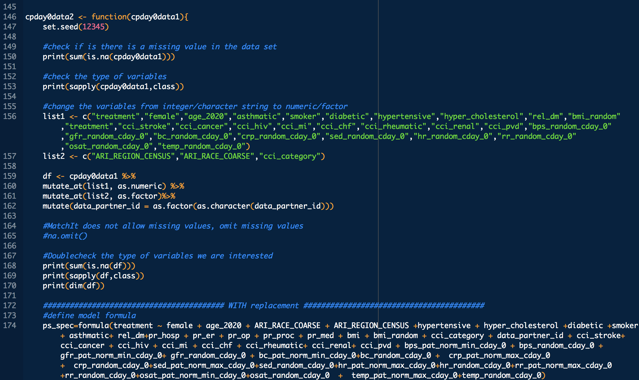
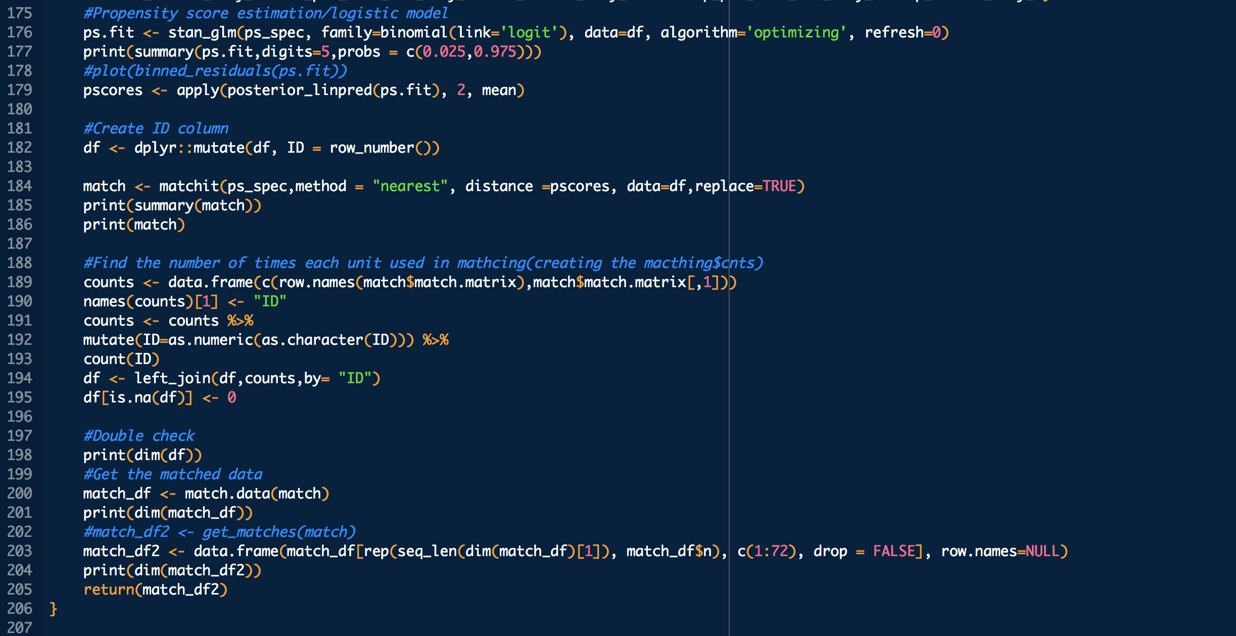
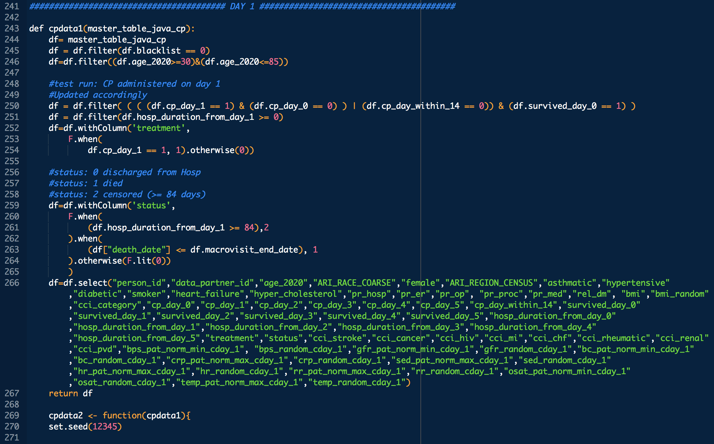
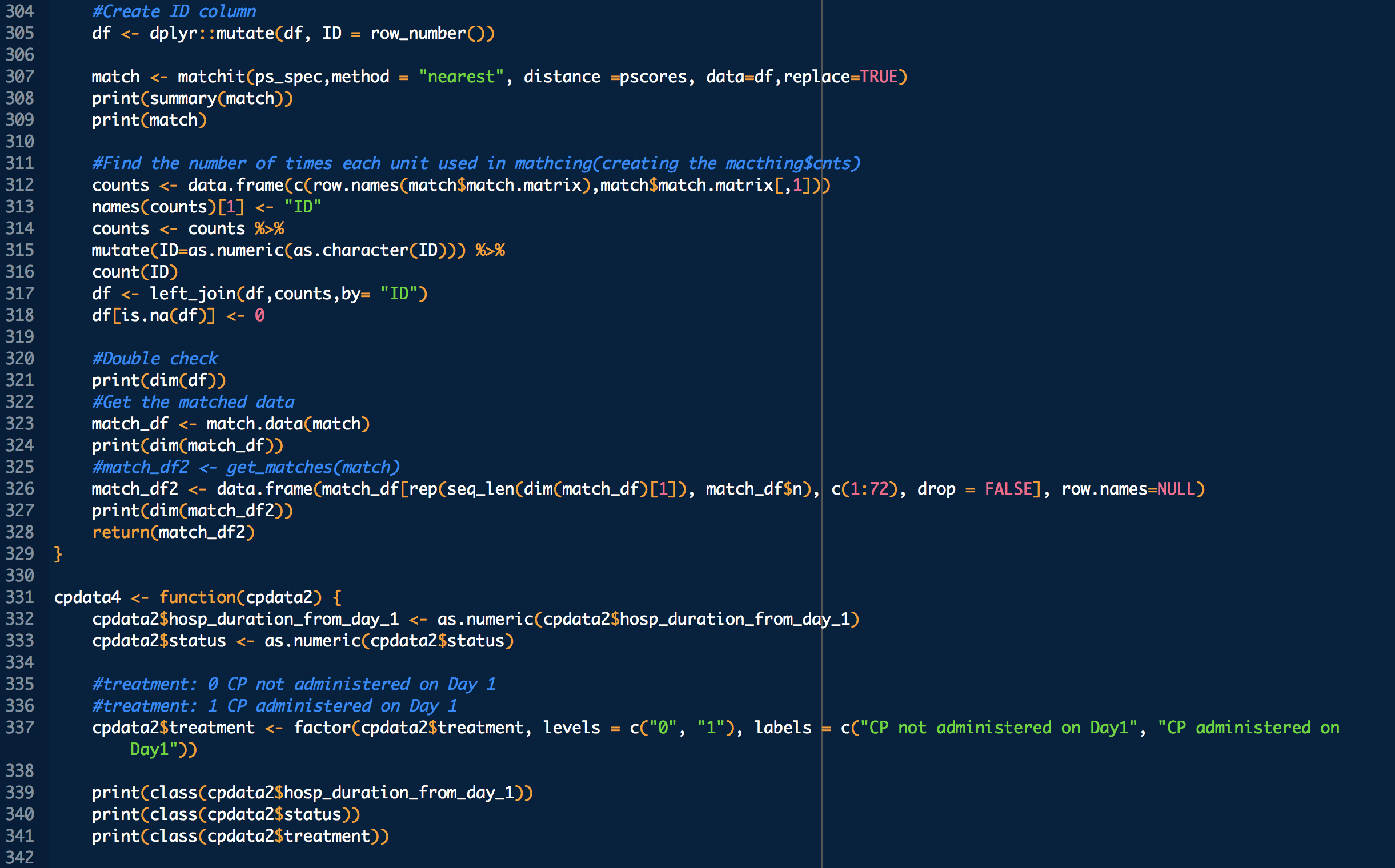
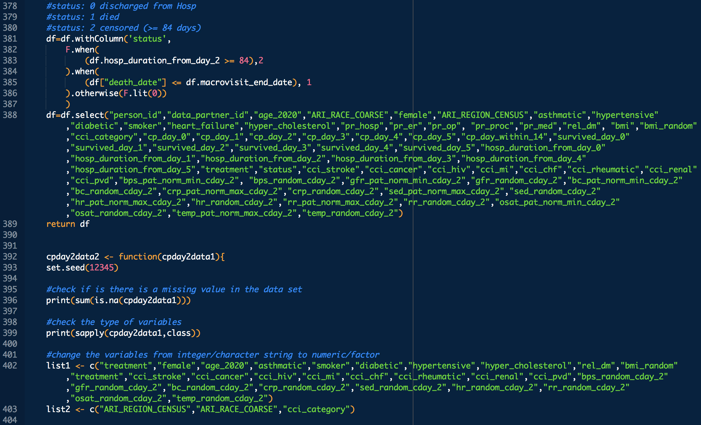
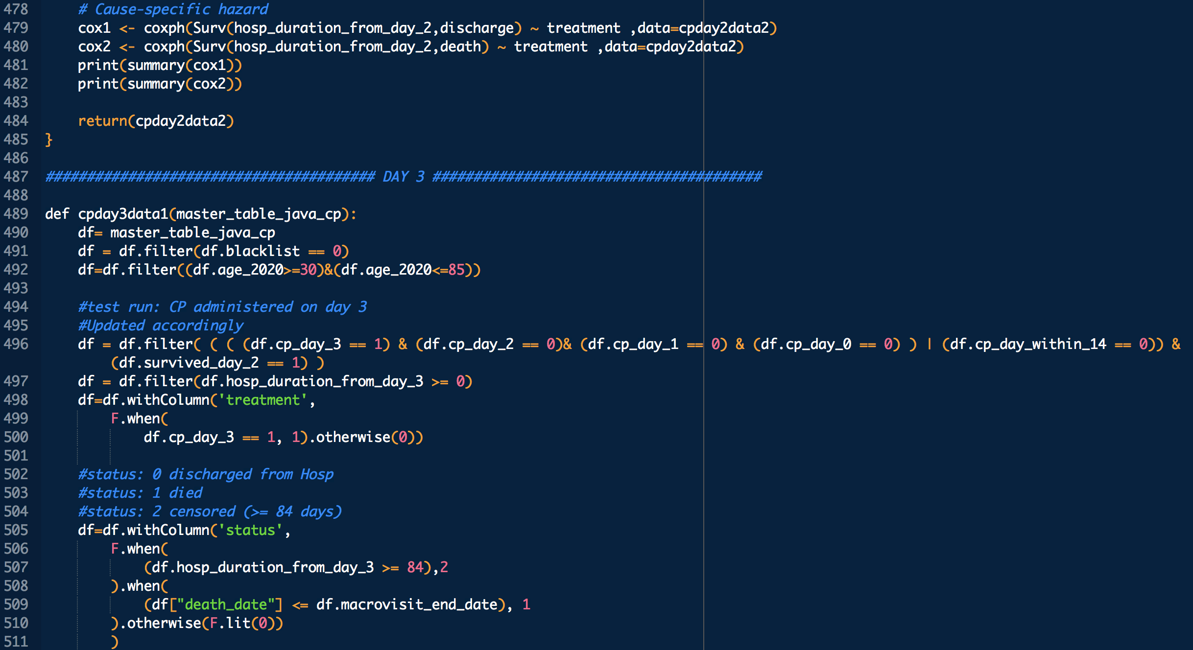
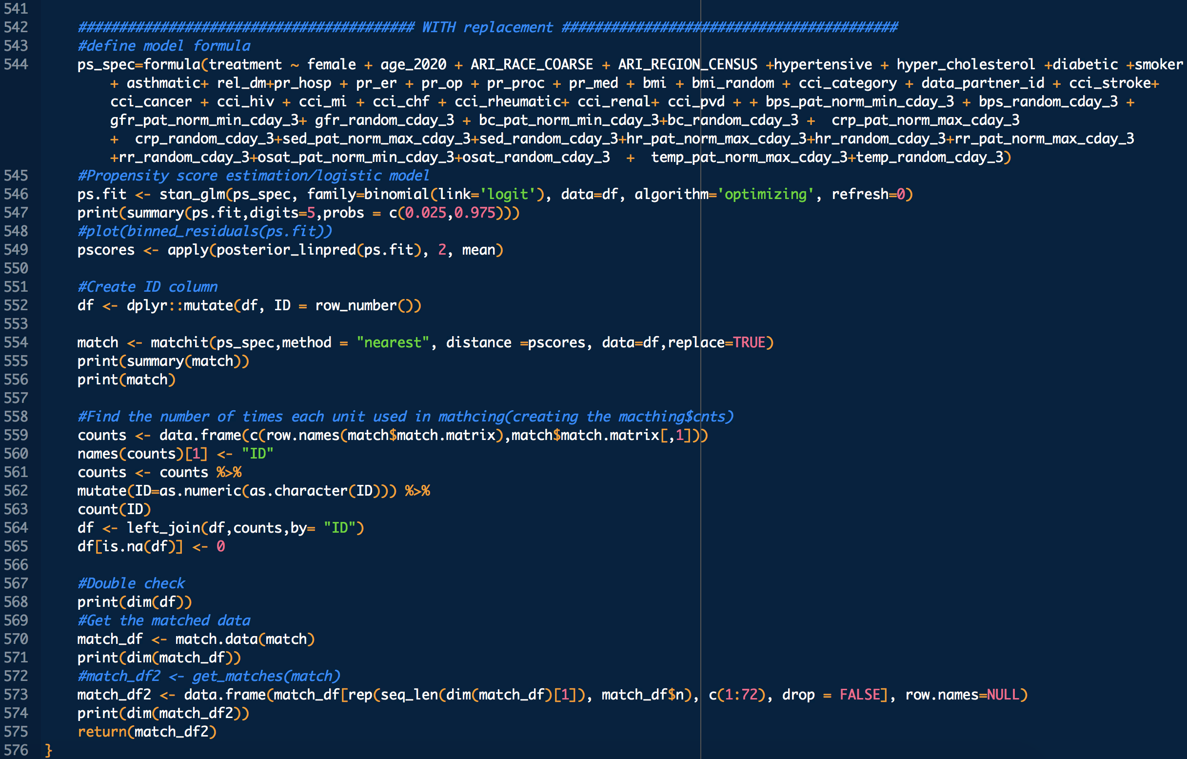
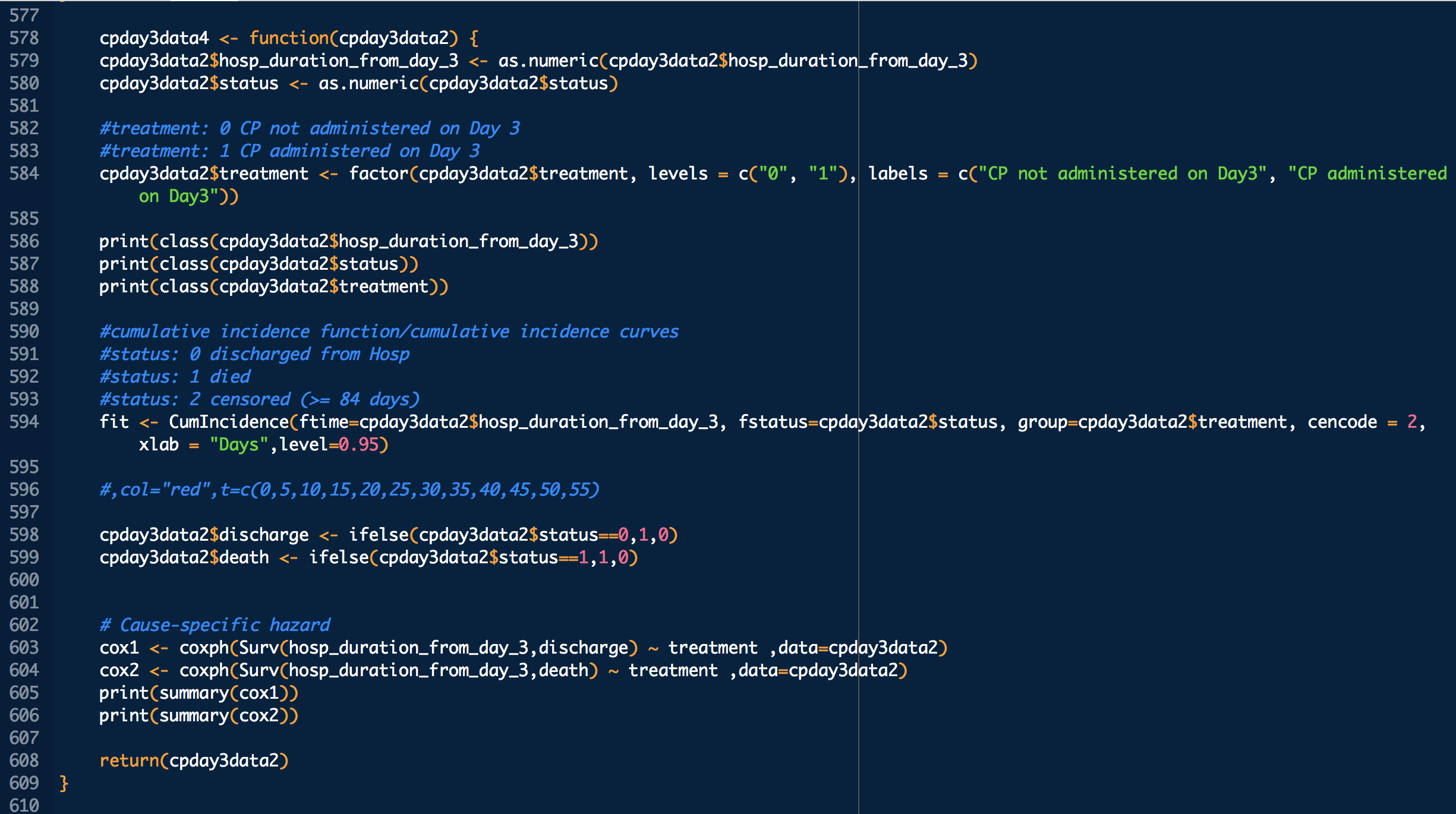
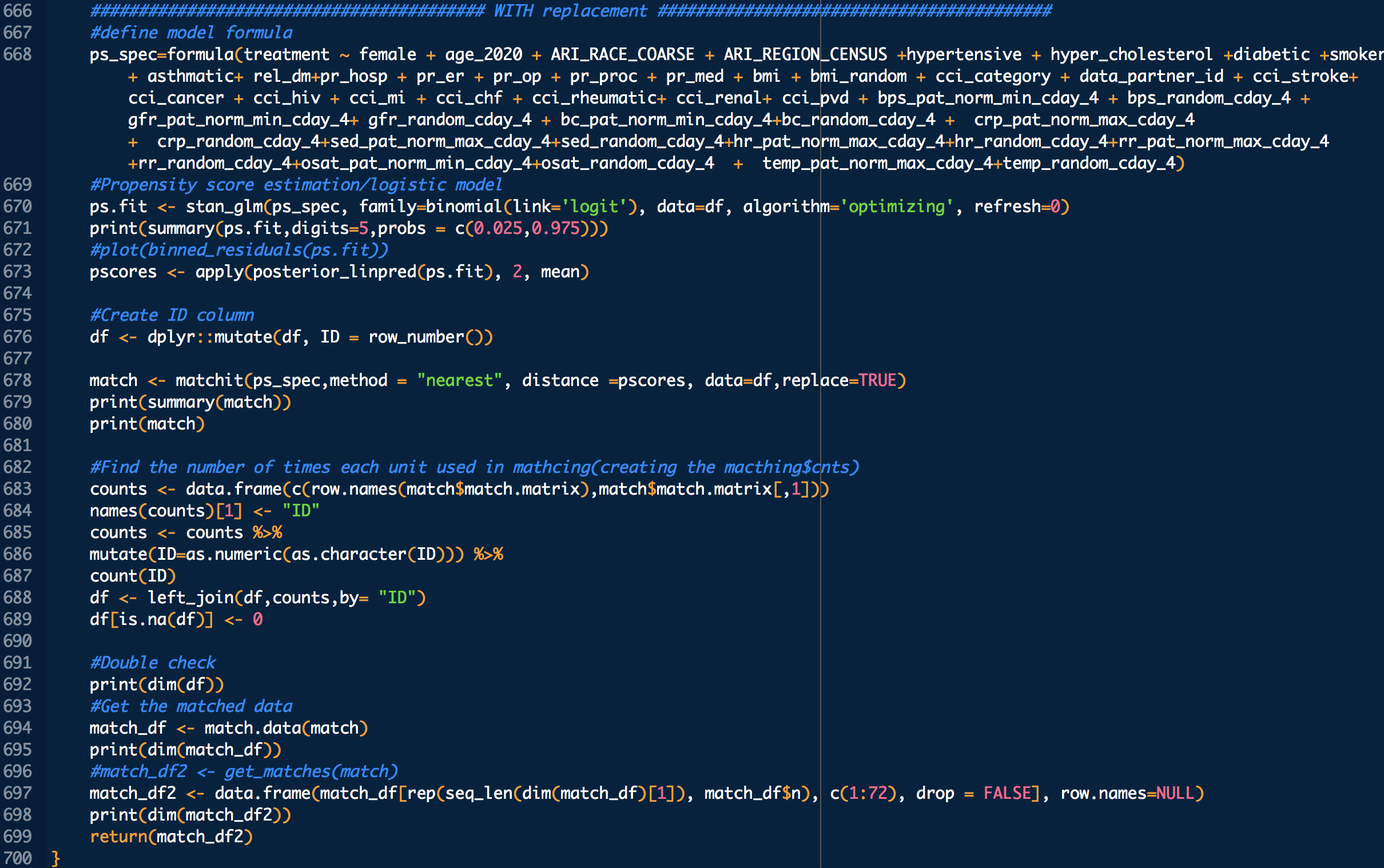
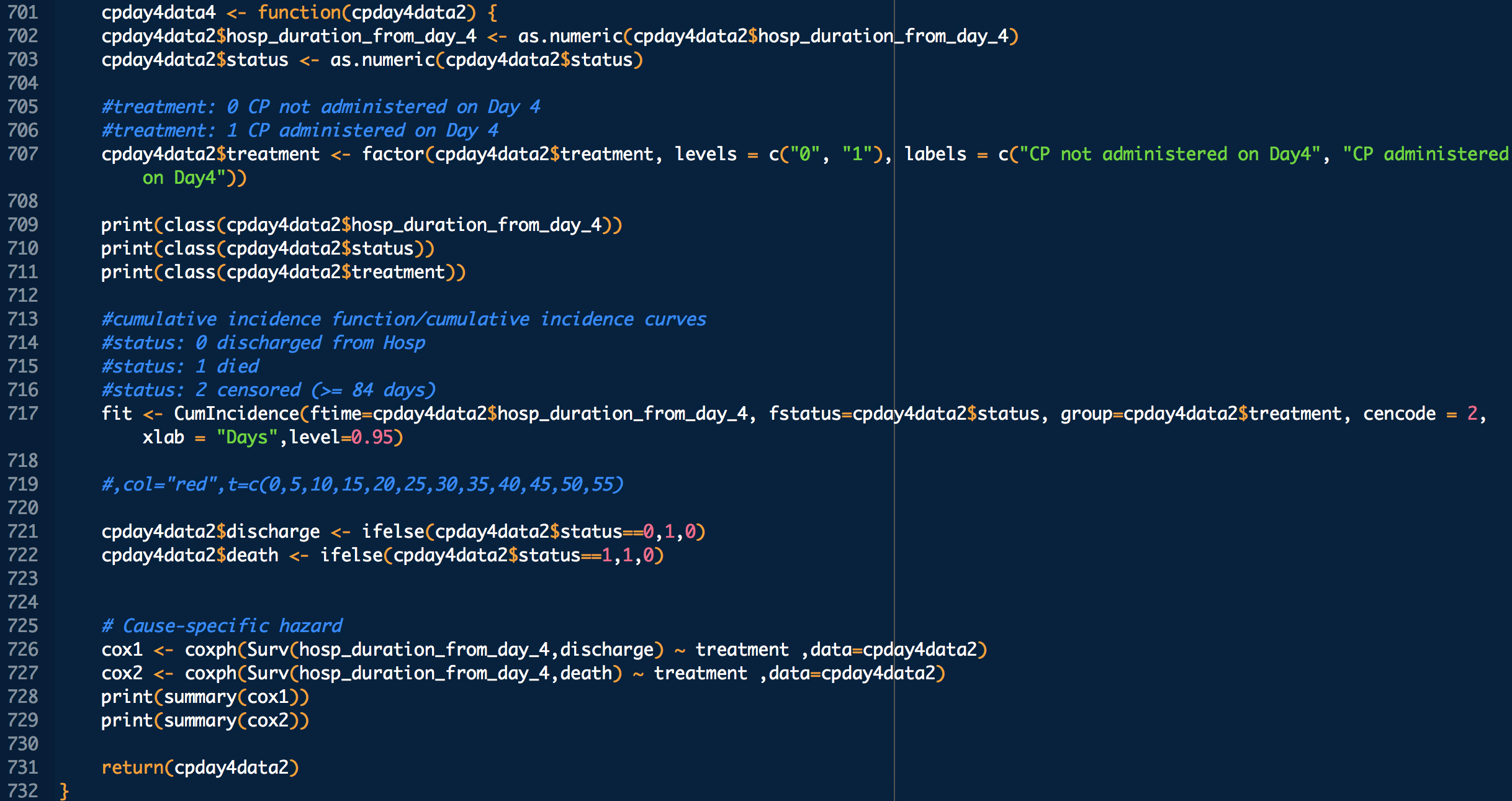
treatment: 1 means treated (with CP), 0 means untreated

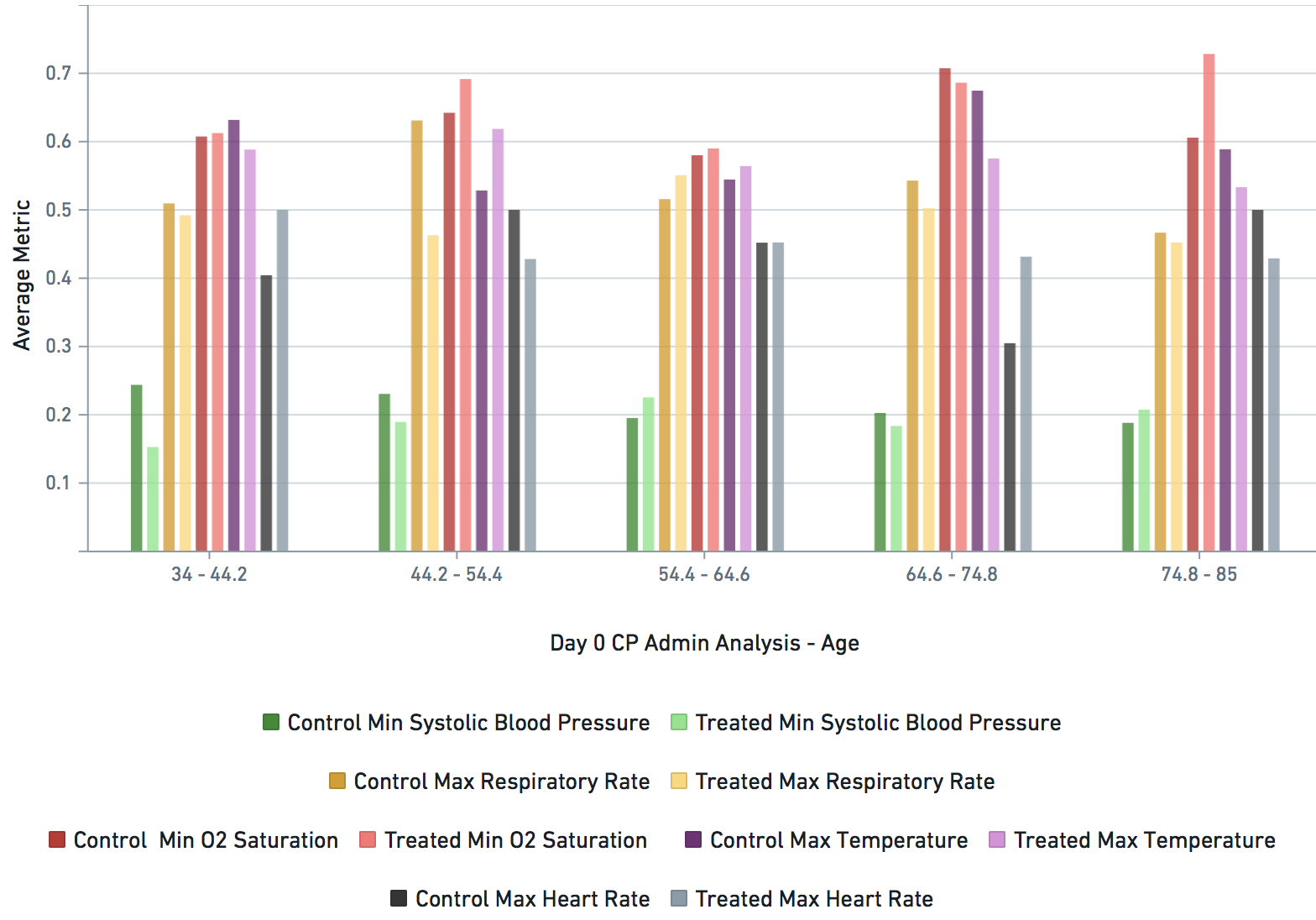
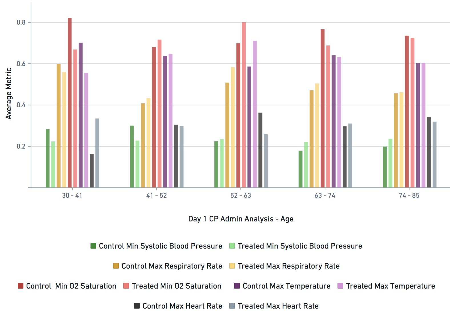
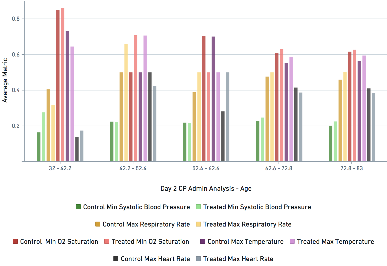
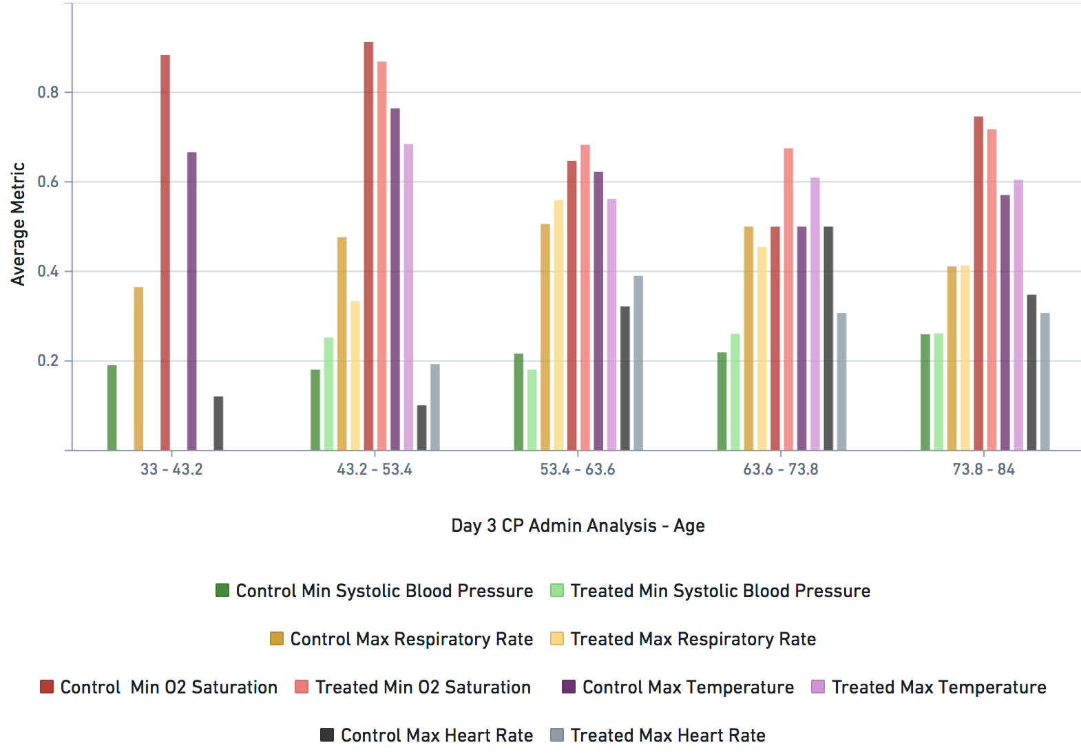
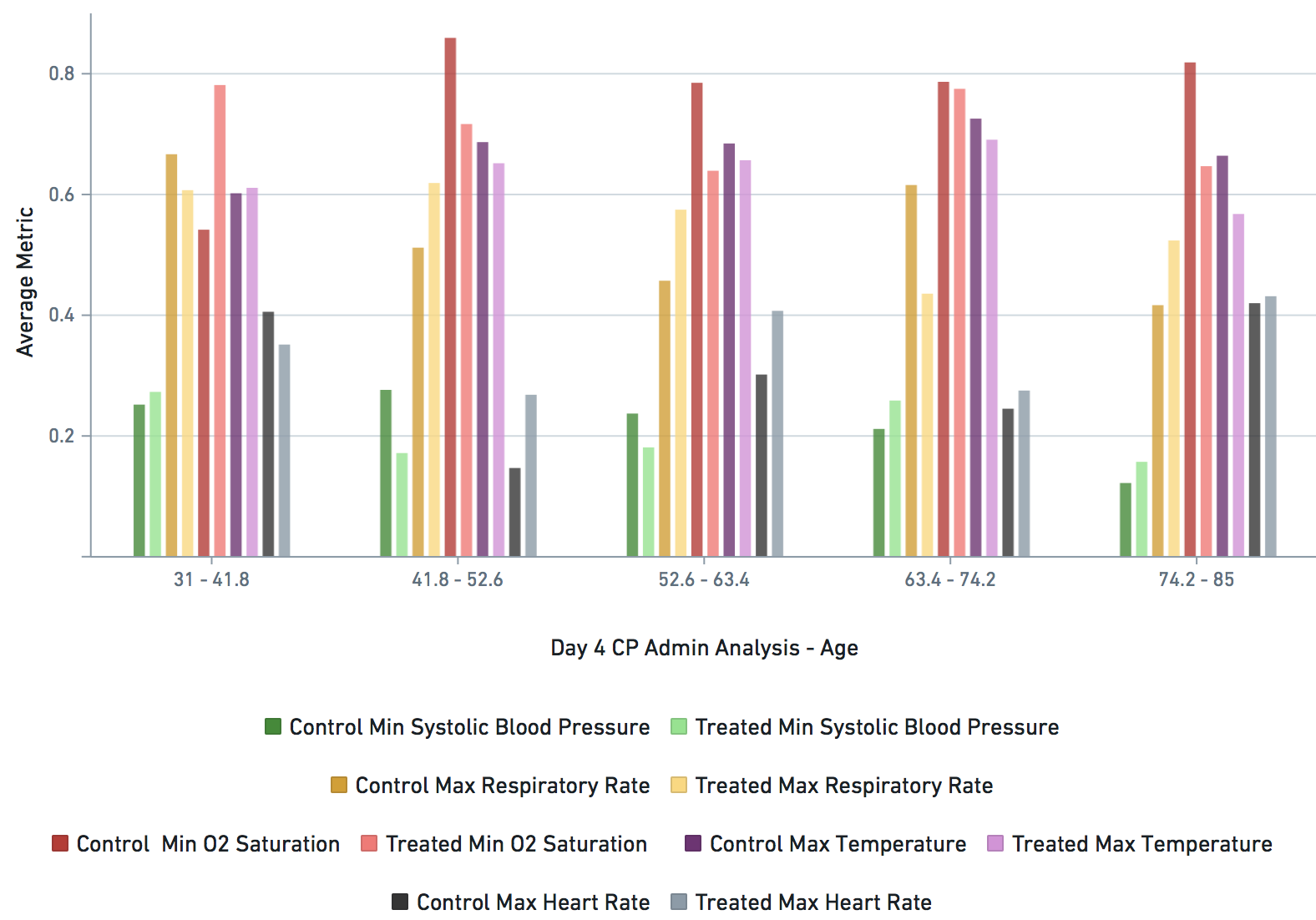
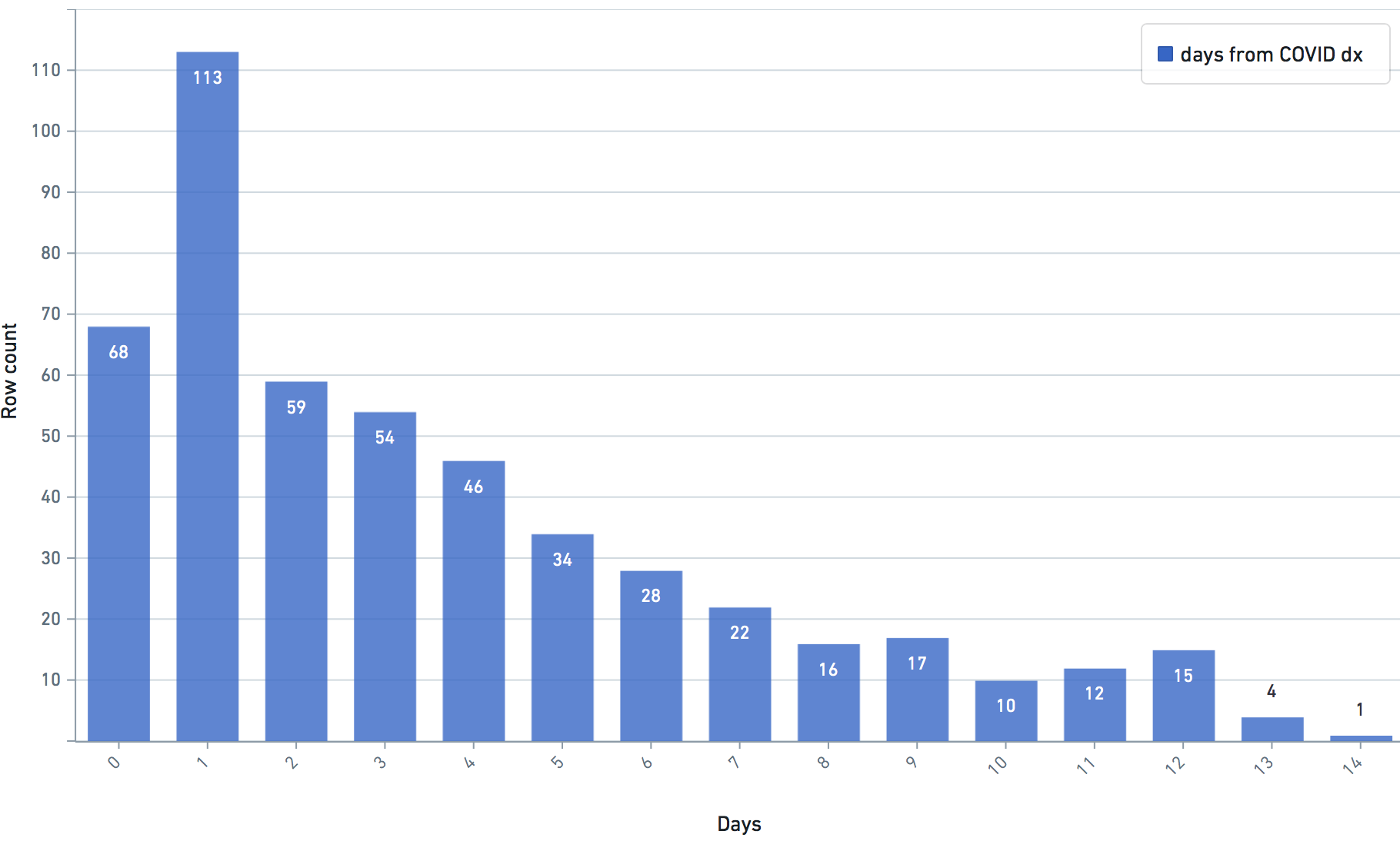
DURING COVID-19 (N below means day of COVID-19 diagnosis, N = 0,1,2,3,4 in this study)
                                
    bps_pat_norm_min_cday_N = minimum systolic blood pressure of patient on day N of COVID-19 diagnosis, range normalized betweeen 0 and 1
    bps_random_cday_N = 1 means there was missing data for blood pressure, 0 means there actual data
    gfr_pat_norm_min_cday_N = minimum GFR on day N of COVID-19 diagnosis, range normalized betweeen 0 and 1
    gfr_random_cday_N = 1 means there was missing data for gfr, 0 means there actual data
    bc_pat_norm_min_cday_N = minimum bi-carbonate on day N of COVID-19 diagnosis, range normalized betweeen 0 and 1
    bc_random_cday_N = 1 means there was missing data, 0 means there actual data
    crp_pat_norm_max_cday_N = maximum C reactive protein on day N of COVID-19 diagnosis, range normalized betweeen 0 and 1
    crp_random_cday_N = 1 means there was missing data for C reactive protein, 0 means there actual data
    sed_pat_norm_max_cday_N = maximum SED rate on day N of COVID-19 diagnosis, range normalized betweeen 0 and 1
    sed_random_cday_N = 1 means there was missing data for SED rate, 0 means there actual data
    hr_pat_norm_max_cday_N = maximum heart rate on day N of COVID-19 diagnosis, range normalized betweeen 0 and 1
    hr_random_cday_N = 1 means there was missing data for heart rate, 0 means there actual data
    rr_pat_norm_max_cday_N = maximum respiratory rate on day N of COVID-19 diagnosis, range normalized betweeen 0 and 1
    rr_random_cday_N = 1 means there was missing data for respiratory, 0 means there actual data
    osat_pat_norm_min_cday_N = maximum O2 saturation day N of COVID-19 diagnosis, range normalized betweeen 0 and 1
    osat_random_cday_N = 1 means there was missing data for O2 saturation, 0 means there actual data
    temp_pat_norm_max_cday_N = maximum body temperature on day N of COVID-19 diagnosis, range normalized betweeen 0 and 1
    temp_random_cday_N = 1 means there was missing data for body temperature, 0 means there actual data


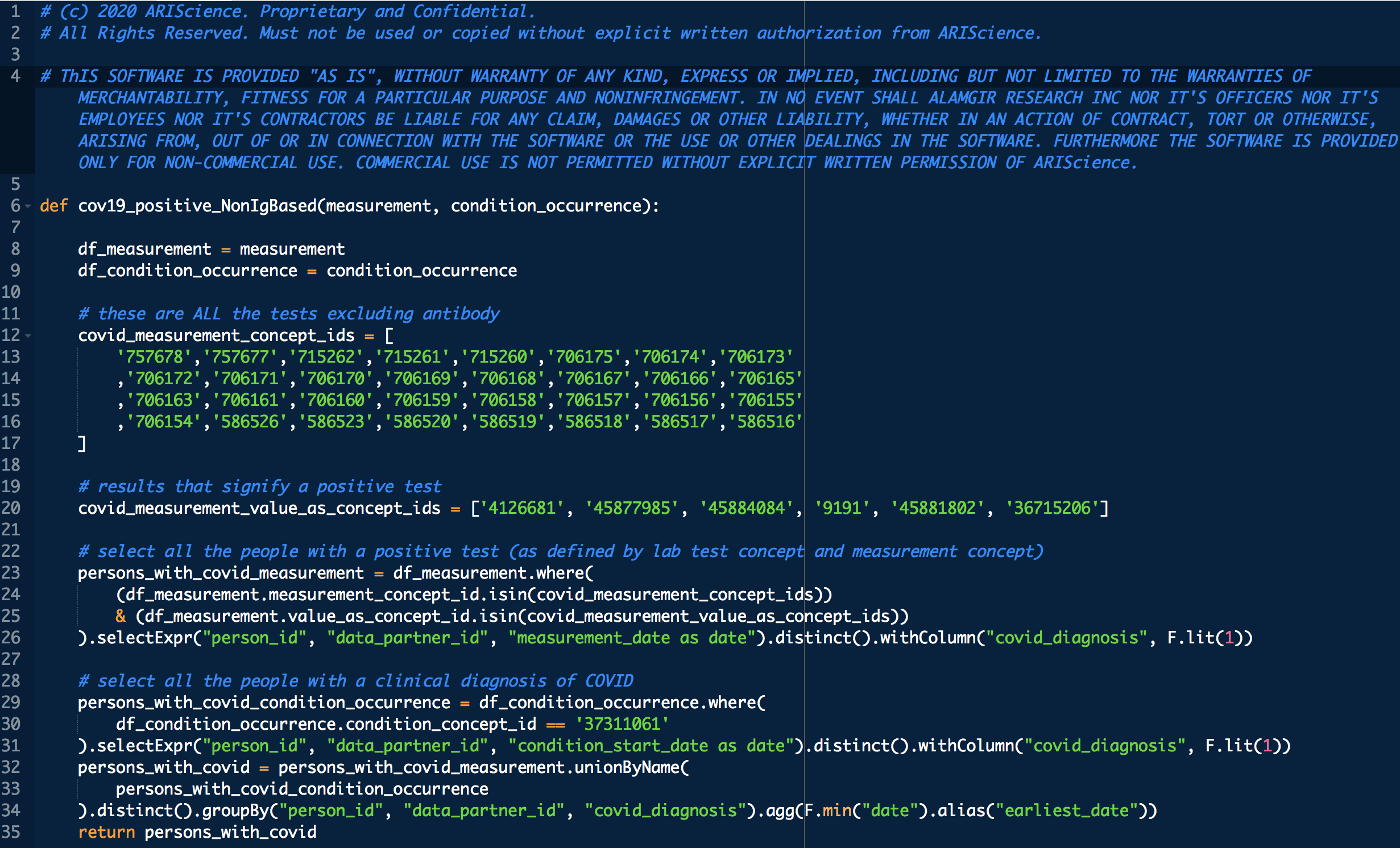
By using any of these resources ("SOFTWARE") in this site you agree that:

THE SOFTWARE IS PROVIDED "AS IS", WITHOUT WARRANTY OF ANY KIND, EXPRESS OR IMPLIED, INCLUDING BUT NOT LIMITED TO THE WARRANTIES OF MERCHANTABILITY, FITNESS FOR A PARTICULAR PURPOSE AND NONINFRINGEMENT. IN NO EVENT SHALL ALAMGIR RESEARCH INC NOR IT'S OFFICERS NOR IT'S EMPLOYEES NOR IT'S CONTRACTORS BE LIABLE FOR ANY CLAIM, DAMAGES OR OTHER LIABILITY, WHETHER IN AN ACTION OF CONTRACT, TORT OR OTHERWISE, ARISING FROM, OUT OF OR IN CONNECTION WITH THE SOFTWARE OR THE USE OR OTHER DEALINGS IN THE SOFTWARE. FURTHERMORE THE SOFTWARE IS PROVIDED ONLY FOR NON-COMMERCIAL USE. COMMERCIAL USE IS NOT PERMITTED WITHOUT EXPLICIT WRITTEN PERMISSION OF ARIScience.